
Introducing Peach Fuzz, the Pantone Colour of the Year

The announcement of Pantone’s Color of the Year as PANTONE 13-1023 Peach Fuzz left The Interiors Edit team celebrating! We’re thrilled with this year’s choice by the world’s pre-eminent predictor of colour trends, which chose a gorgeously girly shade it describes as “subtly sensual, a heartfelt peach hue bringing a feeling of kindness and tenderness.” Which is just what the world really needs right now.

Photography Jotun
Why did Pantone’s choose PANTONE 13-1023 Peach Fuzz as color of the Year?
According to the institute, the colour inspires belonging, recalibration, and an opportunity for nurturing. Nestled between pink and orange on the colour spectrum, PANTONE 13-1023 Peach Fuzz is indeed a comforting colour. It’s also sophisticated and impactful, meaning that it not only makes us feel good, but we can be confident in choosing it to surround ourselves. Why? It has the vibe of a warm neutral, and acts that way, too – meaning it works well with lots of other colours and is also soothing to the eye.
Bring it home: In the picture above, a similar shade of peach, Devine 12083 by paint company Jotun takes centrestage. Feminine and soft, the hue washes the panelled surfaces of a bedroom – even the doors – for a space that’s intimate and cosy yet calming.
“This colour feels positive, enveloping yet refreshing”
~ interiors expert Wendy Moore
Photography www.dorisleslieblau.com.
How to use PANTONE 13-1023 Peach Fuzz
Leatrice Eiseman, Executive Director of the Pantone Color Institute™, describes Peach Fuzz as a shade that resonates with compassion, offers a tactile embrace and effortlessly bridges youth with timelessness. “In seeking a hue that echoes our innate yearning for closeness and connection, we chose a colour radiant with warmth and modern elegance,” she says.
Bring it home: In a neutral living space, this colour can add a gentle burst of pizazz. Use it to upholster soft furnishings and bring a sense of conviviality and warmth, like in the example above discovered via rug company Doris Leslie Braun. With a distinctly Nordic vibe, the colour pairs well with blonde timbers and touches of brass. Modern, relaxed and feminine at the same time.
Photography: via Between The Walls.
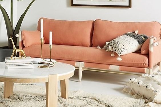
PANTONE 13-1023 Peach Fuzz is a versatile colour
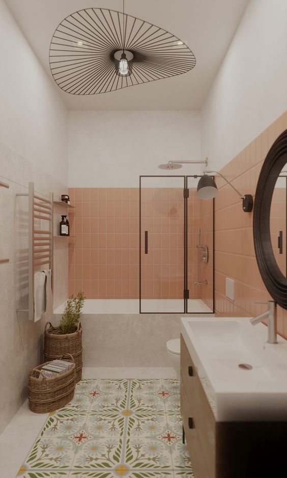
Peach Fuzz has a decidedly different feel to the vim and vigor of 2023’s Color of the Year, Viva Magenta – which we’re not sad about. While last year’s choice was bold, it wasn’t for everybody, and we haven’t seen it cross over to interiors in the way we’d expect. Yet Peach Fuzz promises a lot more: it’s extremely versatile and can be used in any room in the home, even the bathroom, as pictured above.
Bring it home: Peach-coloured tiles wrap this shower zone in warmth. Offset it with textured ceramic or stone, or go full throttle and wrap the colour on all four walls. Here, the warm tone is balanced by a patterned green rug and textured accessories. It’s also a colour that can easily mimic a distinctly Australian palette; where marvelous pink skies sit against grey-green gums and sparkling turquoise seas. Nature rarely gets it wrong!

Photography Bed Threads
Interior styles that work with PANTONE 13-1023 Peach Fuzz
One of the things we’re loving about Peach Fuzz is that you can dress it up or dress it down. It works effortlessly in a range of interior styles, complementing everything from coastal, Boho, MCM and Nordic-inspired interiors, and slides effortlessly into the more formal palette of heritage homes, too.
Bring it home: Bedrooms are places of comfort and repose, where we can rest, reset and re-energise for the day ahead. The room above is a wonderful example of colour that can set the tone; dip your toe into the water with this colour in the bedroom by investing in a set of sheets in the latest warming hues. This linen set in Terracotta by Bed Threads brings just the right tone.